We capture loads of data and use it to improve our understanding of the market and our processes. Here are some exciting visualizations showing the growth of Ola over the past 8 months.
Check out our cumulative booking growth:

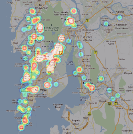
Also, here are two map layouts of the location of customer pickups we’ve done, one till April 2011 and one till August 2011. Each pin represents a chunk of bookings in that locality. This visualization helps us plan which areas to increase our fleet in.


You can clearly see that we’ve seen lots of traction in the past quarter and are now serving requests from every part of Mumbai, even from satellite towns like Dombivli and Panvel!
Another interesting piece of data is the choice of destinations outside Mumbai. The trends are predictable, with most people taking weekend breaks to Lonavala. The breakup in percentages is as below:

We love data and science at Ola and will keep sharing exciting numbers and visualizations for the similar minded in our audience!
Update: Prashanth Jonnala, our in house data and software wiz has come up with this heatmap to better show the distribution of customer pickup locations. Take a look!
